The Heat (Map) is on!
![]()
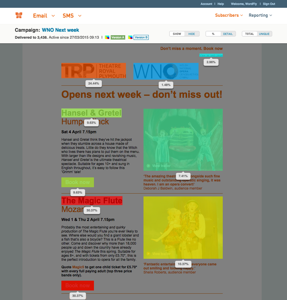
We cooked up a heat map just for email marketers.
All Campaigns. On All Pages.
See the most popular links in your campaign as a colorful overlay on your email. Just click the Heat Map icon when viewing your campaign in Reporting.
Show / Hide Toggle
Use this to explore your heat map or get it out of your way while you gaze at your gorgeous email.
Want to learn more about heat maps?
Be sure to check out this support post for all the details on how to get the most out of heat maps. You might also be interested in our blog post about why we made our new heat map just for the email marketer!

Features you may have missed...
Unsubscribe | Forward | View in browser
WordFly is thoughtfully developed by POP.
1326 5th Ave, Suite 800, Seattle, WA 98101
Copyright 2015 POP. All rights reserved.
![]()